What is an organizational chart? Your guide to clear company structures
An organizational chart is much more than a diagram. It is the visual map of your company, showing roles, reporting lines and how departments and teams work together.
An organizational chart is much more than just a pretty diagram. It is the visual map of your company and shows you at a glance who has what role, who reports to whom and how all departments and teams work together. Think of it like the blueprint of a building - without it you quickly lose orientation.
What exactly is an organizational chart and why do you need it
Imagine that you are new to a large project team or company. You see dozens of faces, hear countless job titles, but have no idea how everything is connected. An organizational chart solves exactly this problem. It immediately creates clarity about hierarchies and responsibilities and turns a confusing bunch of people into an understandable structure.
This graphic overview is not just a decorative element for the HR department. It is a tough, practical tool that makes everyday work easier for you and your team. New employees find their way around immediately and existing teams see how their work is directly linked to other departments.
The benefits in everyday working life
An organizational chart makes invisible structures visible. It provides you with lightning-fast answers to the really important questions: Who approves my budget? Who should I contact if I have IT problems? Who has the final say in marketing? This transparency not only avoids annoying misunderstandings, but also speeds up decisions because the communication channels are crystal clear.
A good organizational chart is like a navigation system for your company. It not only shows where everyone stands, but also how you can get from A to B as quickly as possible without getting lost in the jungle of responsibilities.
The practical benefits extend to all areas of your business. From strategic personnel planning to daily collaboration – a clear structure is the foundation for smooth processes. If you want to delve deeper into the role HR plays, read our article on Importance of Human Resources.
So that you can immediately see the direct added value for your everyday life, we have summarized the most important purposes of an organizational chart for you here.
The core functions of an organizational chart at a glance
This table summarizes the most important purposes that an organizational chart serves in your company.
| Function | Description | Practical benefit for you |
|---|---|---|
| Structural visualization | Shows the hierarchical structure of the company, including departments and teams. | You immediately recognize the entire company structure and know where you and your team are positioned. |
| Clear responsibilities | Clearly defines who is responsible for which tasks and has what decision-making authority. | You know exactly who your contact person is for specific topics, which simplifies communication. |
| Transparent reporting lines | Makes it clear who reports to whom and shows the authority within the organization. | You understand the chain of command and know who to contact for escalations or approvals. |
As you can see, the organizational chart is not a static document, but a living tool that helps you master the complexity of your company.
The most common organizational chart shapes simply explained
An organizational chart is much more than just a few boxes and lines. Depending on the size, industry and goals of your company, there are completely different models for representing internal collaboration. Choosing the right form is crucial because it determines how clear communication channels and responsibilities really are for everyone in the team.
Basically, every organizational chart answers one central question: How do we best organize our collaboration? Let's look at the three most common types so that you can find the model that really suits you.
This infographic gets to the point: A well-thought-out structure is the foundation for clarity, defined roles create commitment and orderly communication ensures smooth processes.
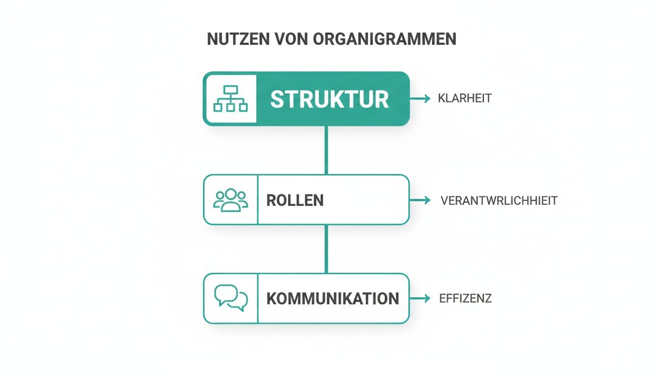
The graphic makes it clear: Without a clear structure, a lot of energy is wasted in frictional losses instead of flowing into productive work.
The functional organizational chart
The functional organizational chart is the absolute classic. You probably know it: The company is sorted by department - a marketing department, a sales department, an IT department and so on. At the top is the management, from which the individual lines lead down like branches of a tree.
This form is ideal for small to medium-sized companies or those that specialize in a specific service or product. Think of a web design agency that is clearly divided into “design”, “development” and “customer support” teams. The biggest advantage here is the deep technical expertise that is built up within the departments.
The divisional organizational chart
If a company grows rapidly or expands its offering, the functional model quickly reaches its limits. This is exactly where the divisional organizational chart comes into play. Instead of being structured according to functions, the organization is structured according to business areas, the so-called divisions.
Such divisions can refer to very different things:
- Products: An electronics company could have a division for televisions and one for smartphones.
- Markets or regions: A beverage manufacturer divides its structure into “Europe”, “Asia” and “North America”.
- Customer groups: A software provider separates its areas for private customers and business customers.
Each of these divisions operates almost like a small, independent company. It often has its own functional areas such as marketing and sales. This creates enormous focus and makes the entire company much more flexible in order to react specifically to the needs of a market.
A divisional structure is perfect if you want to manage different business areas independently of each other without the areas slowing each other down.
The matrix organizational chart
The matrix organizational chart is a mixture of the functional and divisional structure. Here, employees essentially have two superiors: a technical manager from their department (for example, the head of IT) and a project or product manager (for example, the person responsible for a specific customer project).
You will find this structure primarily in project-based industries such as event agencies, construction or management consulting. Imagine an event agency that is planning a large music festival and an important company party at the same time. A sound engineer belongs to the “Technology” department, but works temporarily for the project manager of the music festival. This double assumption promotes the exchange of knowledge and flexibility, but also carries the risk of conflicts of priorities.
What organizational charts look like in practice
Enough of the gray theory. An organizational chart only realizes its true value when you see it in action. Abstract boxes and lines suddenly become a clear roadmap for daily collaboration.
Let's make the whole thing tangible using three concrete examples from different industries. You will quickly see how the different structures adapt to the respective challenges.

These images help you to transfer the different construction forms directly into your own work context. They show at a glance where responsibilities lie and how communication channels should run in practice.
Case study 1: The music festival
Imagine a large music festival with tens of thousands of visitors. Here, a smooth process is not only desirable, but crucial to business. An organizational chart creates the necessary structure in this highly complex interaction.
- Festival management: The overall management is at the top. She is responsible for the budget, the strategic direction and makes the final decisions.
- Area management: Directly below are the operational heads for key areas such as stage management, security, ticketing and catering.
- Team leaders & Teams:Within the catering industry there is a team for the bars and one for the food trucks. Each team has its own management who reports directly to the gastro department manager.
The organizational chart for such an event is often a clever mix of functional and matrix structure. A stage technician is technically part of the central technical team, but reports to the head of the main stage for the duration of the festival. This means it is always clear who is in charge on site.
Case study 2: The hotel
In a hotel, countless cogs have to fit together perfectly to ensure the guest has a flawless stay. The structure is usually clearly hierarchical and divided according to functions - a classic field for a clear organizational chart.
At the top is the hotel management. The main departments that keep the store running branch out from there.
- Front Office:Receptionists and concierges work here under the direction of the Front Office Manager.
- Housekeeping: The head housekeeper coordinates the chambermaids and cleaning staff.
- Food & Beverage (F&B): This includes restaurant, bar and room service. Service and kitchen teams work here under the F&B management.
An organizational chart like this makes it immediately clear who the right person to contact if a guest complains about the food - namely the F&B management and not the reception.
Case study 3: The care facility
In healthcare, especially in a nursing facility, crystal clear responsibilities and seamless communication are literally essential for survival. The organizational chart here usually follows a strictly hierarchical line to ensure the high quality of care at all times.
In highly regulated industries such as nursing, the organizational chart is not just used for internal orientation. It is often an integral part of quality management and important evidence for regulatory authorities.
A typical structure looks like this:
- Nursing Services Manager (PDL): Bears full responsibility for the quality of care, personnel management and compliance with standards.
- Station management: Each ward or living area has its own management who reports directly to the PDL and serves as the first point of contact for their team.
- Nurses & Nursing assistants:These employees report to the respective ward management and provide daily care to patients.
These three examples show: An organizational chart is not a rigid corset. It is a flexible tool that adapts to the real needs and complexity of an organization. His goal is always the same: to create clarity where people achieve great things together.
Create your own organizational chart step by step
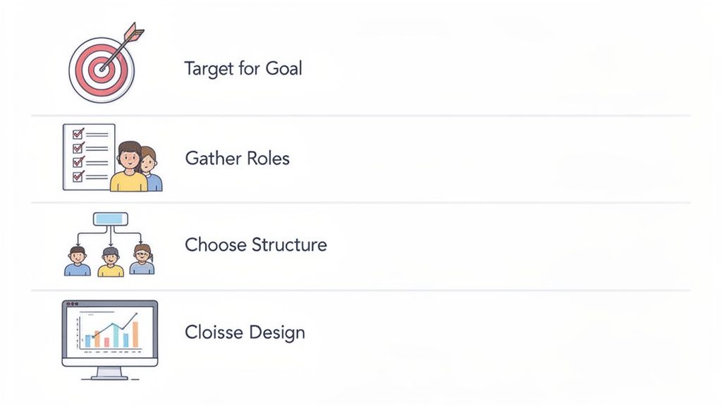
Now it's getting concrete. Designing an organizational chart is not rocket science – if you know how. We'll guide you through the four crucial steps so that in the end you don't just have a beautiful picture, but a real working tool in your hands.
See these instructions as your tried-and-tested recipe. If you stick to it, nothing can go wrong.
Step 1: Clearly define the goal
Before you draw a single line, you have to answer the most important question: What exactly is this organizational chart supposed to do? This question decides everything else.
Should it strategically reflect the entire company and serve as a long-term reference? Or do you need a flexible overview for a time-limited project, such as planning a large trade fair? A company organizational chart is usually static and designed for stability, whereas a project organizational chart is dynamic and temporary.
Step 2: Gather all necessary information
As soon as you have your goal, the real hard work begins: collecting the data. You create a complete list of all relevant people and clarify who has what role and to whom they report.
For this you absolutely need:
- Names and job titles: Who are the players in your company or team?
- Responsibilities and reporting lines: Who is responsible for what and who is the direct manager?
- Departments or teams: How are the employees logically grouped?
Accuracy at this stage is critical to the usefulness of your diagram. Clear functional descriptions are worth their weight in gold here. If you notice at this point that the roles are unclearly defined, you will find valuable tips in our article on the topic Creating a requirements profile.
Step 3: Choose the right structure and the right tool
Now it's time to get down to business. Based on your data and the defined goal, you decide on the right form of presentation. Is the structure of your business clearly structured according to functions? Or do you need a flexible matrix structure that displays different reporting lines for a complex project?
Then you choose the right tool. For simple, static diagrams, programs such as PowerPoint or Google Slides are often sufficient. For more complex structures or organizational charts that you need to update regularly, specialized online tools such as Lucidchart or Miro are the better choice.
Choose a tool that you feel comfortable with and that fits your everyday work routine. The best organizational chart is of no use if it is too complicated to maintain and becomes outdated after a few weeks.
Step 4: Make the diagram clear
The last step is about the visual implementation. Your ultimate goal is maximum comprehensibility at first glance. Use a clean font, uniform shapes for the different hierarchy levels and ensure there is enough space between the individual elements.
The following applies here: Less is more. Reduce the information in each box to the absolute minimum - name, role and perhaps a photo are usually completely sufficient. It is better to store additional details such as contact details or precise task descriptions in a linked document or on the intranet.
This means your organizational chart remains a clear, concise map and does not degenerate into an unreadable jumble of text.
Typical mistakes in organizational charts and how to avoid them
An organizational chart should create clarity. In practice, however, it often becomes the exact opposite: a confusing diagram that causes more confusion than it provides orientation. The good news is: most mistakes repeat themselves. Anyone who knows them can handle them cleverly right from the start.
The first trap that many people fall into is the overloaded organizational chart. In an attempt to represent absolutely everything, the boxes are crammed with details – phone numbers, detailed job descriptions, or even photos. The result is an illegible graphic in which the actual purpose, the quick overview, is completely lost. Focus on what really matters: name, role and direct reporting line.
A good organizational chart is like a street map, not a detailed map of every single street. It shows the main traffic arteries and connections so that you can get from A to B quickly without getting lost in the small details.
An equally classic mistake is the outdated organizational chart. Your company is a living organism: roles change, teams are reshaped and employees come and go. An organizational chart that hasn't been touched in a year is essentially worthless.
How to keep your organizational chart up to date and clear
To ensure that your organizational chart remains a useful tool and doesn't end up gathering dust in a digital drawer, there are a few simple but effective solutions to the most common problems.
-
Problem: Unclear reporting lines
Sometimes it is not clear at first glance who reports to whom. This can quickly become confusing, especially in matrix structures.- Solution: Use clear visual language. Solid lines represent direct authority (the disciplinary superior). Dashed lines are perfect for technical or project-related assignments. So everyone knows immediately where they stand.
-
Problem: Lack of regularity
The diagram is created once with a lot of effort and then completely forgotten.- Solution: Link the update to existing HR processes. Set a fixed rhythm, for example quarterly, or update the organizational chart whenever someone new comes on board or a promotion is pending.
-
Problem: Incorrect level of detail
The diagram is either too vague to be useful or so cluttered that no one can understand it.- Solution: Think in levels. Create a master overview that shows only the core structures. For more detailed information about individual teams or projects, simply create separate, linked detailed organizational charts.
If you pay attention to these points, you will ensure that your organizational chart fulfills its most important function: it becomes a lively and helpful tool in everyday work and answers the question “What is an organizational chart?” with real clarity.
When the organizational chart reaches its limits
A classic organizational chart is a fantastic basis, no question. It shows you the basic architecture of your company – who belongs to which team, who reports to whom. But what is this chart really worth in today's flexible working world? It is a static snapshot that can often no longer keep up with dynamic reality.
Especially in industries such as event organization, catering or logistics, where you juggle changing teams, freelancers and temporary workers every day, the rigid model quickly reaches its limits. Your organizational chart may show you that a project manager is responsible for the service staff. But it doesn't tell you who's actually working the late shift at the bar tonight.
From rigid hierarchy to dynamic planning
The reality in many companies is far more complex than any graphic, no matter how detailed, could depict. Not only do you have to know the formal hierarchy, but you also have to keep an eye on the operational availability, the specific qualifications and the current workload of your employees.
This is exactly where modern workforce management platforms come in. They take the crucial step further that the classic organizational chart leaves out.
- Real-time data instead of a snapshot: Instead of a fixed structure, you can see live who is available, who has what qualifications and who can be scheduled for the next shift.
- Flexibility for the gig economy: Freelancers and temporary workers, who often don't even appear in an organizational chart, are integrated into the planning as full-fledged resources.
- Automated communication: Instead of manual calls or emails, shift requests are automated and sent specifically to suitable employees.
The following view of a modern workforce management platform shows what operational planning can look like in practice.
You don't just see a list of people here. You'll see an interactive tool that helps you find the right people for the right job at the right time.
Create the perfect connection
Does this mean you can throw away your organizational chart? Absolutely not. It retains its strategic value because it defines the basic order and reporting lines of your company. The real strength lies in the combination of both worlds: You use the organizational chart as a strategic foundation and a dynamic tool for daily, operational planning. Find out more about how digitalization in human resources bridges the gap between structure and flexibility.
Think of your organizational chart as the architecture of your house. Smart home technology is a dynamic workforce tool that ensures that everything works smoothly in everyday life - from lighting to heating to security.
This way you combine the best of both worlds: the structural clarity of an organizational chart and the operational agility of a modern planning tool. You not only know who is theoretically responsible, but also who is practically available and qualified to complete the task at hand.
Frequently asked questions about the organizational chart
An organizational chart seems simple at first glance, but in practice the same questions arise again and again. Here we clarify the crucial points so that you not only understand the concept, but also apply it correctly.
Why do you need an organization chart anyway?
Think of your company as a map. An organizational chart is just that: a visual overview that shows you at a glance who is where. It answers the three most important questions for a functioning collaboration: Who is responsible for what? Who is reported to? And how do the various departments interact with each other?
Without this clear structure, orientation is quickly lost - for new employees as well as for long-standing team members.
Is an organizational chart also useful for small teams?
Yes, absolutely. The idea that organizational charts are only for large corporations is a common misconception. Even in a small team of five or ten people, a clear structure ensures clarity and prevents misunderstandings.
It helps new employees to find their way straight away and makes responsibilities transparent for everyone. This means there are no frictional losses at all because everyone knows who the right contact person is.
An organizational chart is not a tool for large corporations. It is a tool for any team that wants to create clarity about roles and responsibilities.
How often should you update an organizational chart?
An outdated organizational chart causes more confusion than benefit. In today's dynamic working world, where roles and team compositions are constantly changing, up-to-dateness is the be-all and end-all. It's best to link maintenance to processes that already exist:
- With every personnel change: A new team member joins, someone is promoted or leaves the company? This is the perfect trigger to immediately adjust the organizational chart.
- At fixed intervals: Plan a regular review, for example once a quarter. This way you can ensure that the structure shown actually corresponds to reality.
Can an organizational chart be too rigid?
This concern is absolutely justified. A classic, static organizational chart has its limits. Although it shows the formal hierarchy, it often fails to reflect the flexible reality of daily work - for example in project work, changing shifts or temporary assignments. It answers the question “Who is the boss?”, but not “Who is doing this specific task today?”
That's exactly why the key lies in the combination: Use the organizational chart as a strategic basis for the rough structure and combine it with dynamic tools for operational planning. In this way you create a bridge between structural clarity and the flexibility that your day-to-day business requires.
Do you want to transform your personnel planning from rigid theory into flexible practice? job.rocks helps you find the right employees at the right time for the right task - dynamically and in real time. Discover now on https://job.rocks how you can take your team management to the next level.